Profile photos on social media profiles are critical to your online success as a business, organization, nonprofit, or individual. Let’s talk about the reasons why.

Because of (sporting) world events, I recently had to change the cover image on The Rocket Group’s Facebook page. It got me to thinking about how we all use our other profile photos. Many of us online are doing ok professionally with our images, some of us are doing great, and some of us doing really, really bad jobs.
What is the purpose of a social media profile image?
There are a lot of reasons why your profile photo is so critical. To put this in terms some of us may understand, the image is basically your online dating profile for your professional efforts.
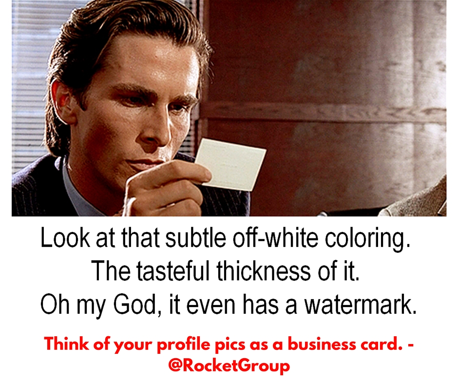
- It represents your business, organization, nonprofit, or yourself: Another way to think of modern social media images is as business cards. The days of raised letters on off-white cards are gone. Now your card needs to be dynamic and stand out from the stack it’s going to piled in on someone’s desk.
- It needs to be recognizable: The image should not just look like you and yours but it should remind me of you and yours when I see it. For mine images, I use tools I use in my speaking and training presentations to drive another connection with the viewer. What can you use in yours to drive that business connection?
- It needs to create a positive first impression: Just like in the online dating example, many folks who encounter you online will first see you through your profile photo. If it’s a silly or bad photo, they will think you are silly or bad. Think about how you form opinions on the people and brands you encounter online based on their profiles. People are doing the same with you. In fact, this is one of our #TRGrules.
- It needs to stand out in crowded timelines and newsfeeds: The average person sees some 250-300 posts each time they scroll through Facebook and Twitter and the other social media platforms. Making your profile image one that stands out from the crowd in all that thumb scrolling will lead you to greater success. Use colors, use props, use your products to get noticed in the timelines!

Don’t Do These Things with Your Social Media Profile Image
- Don’t hide behind a logo: Unless you are in or around the Fortune 500 you should probably use images of happy, smiley faces versus your logo for a social media image. People connect with people not logos online. This is especially critical for small- and medium-sized operations. If you do need to use a logo, make it a photo of your door or sign or something human they can relate to instead of a vector image. If you can get a pic of you doing your job, well, all the better.
- Don’t use too- or non-professional images: Scroll through your LinkedIn and see all the profile photos shot in a studio with a drab background. Now scroll through your Facebook and see how many friends are using party pics as their profile photos. Avoid this trap, get a high end camera (everyone has one these days) and go outside, go to your shop floor, go to a local landmark and take your new amazing photo. When it comes to possibly using non-professional images, make sure your clothing is appropriate, your alcohol level is non-existent, and your face is pleasant.
- Don’t fall for hacktivism: It’s cool to support the many worthy causes out there but adding ribbons to your image or making your image a superhero is only helping to blend your profile into a mass of unrecognizability or political discussion you don’t want to be in. Want to be an activist through your pro channels? Write a blog and post it to social media.
Where Can You Find Inspiration for Your Profile Images?
- Look to accounts you admire: I just did a quick scroll through my Twitter feed (as I admire everyone I follow) and found three cool profile photos in less than a minute. I also saw a couple hundred photos that all looked the same. Author James Altucher is known for his “unique” appearance and his great ideas, his profile photo reflects that. Broadcaster Mark Reardon has a cool image of him at work in the studio. Brash T-Mobile CEO John Legure has an image which is brand-loyal and shows him passionately at work.
- Look for great photos of you and yours: Content that shows behind the scenes of any operation is always a great driver of interaction. There are probably hundreds of photos (everyone has a camera these days) of you and your efforts at work. Look to one of them that will stand out and put it to work.
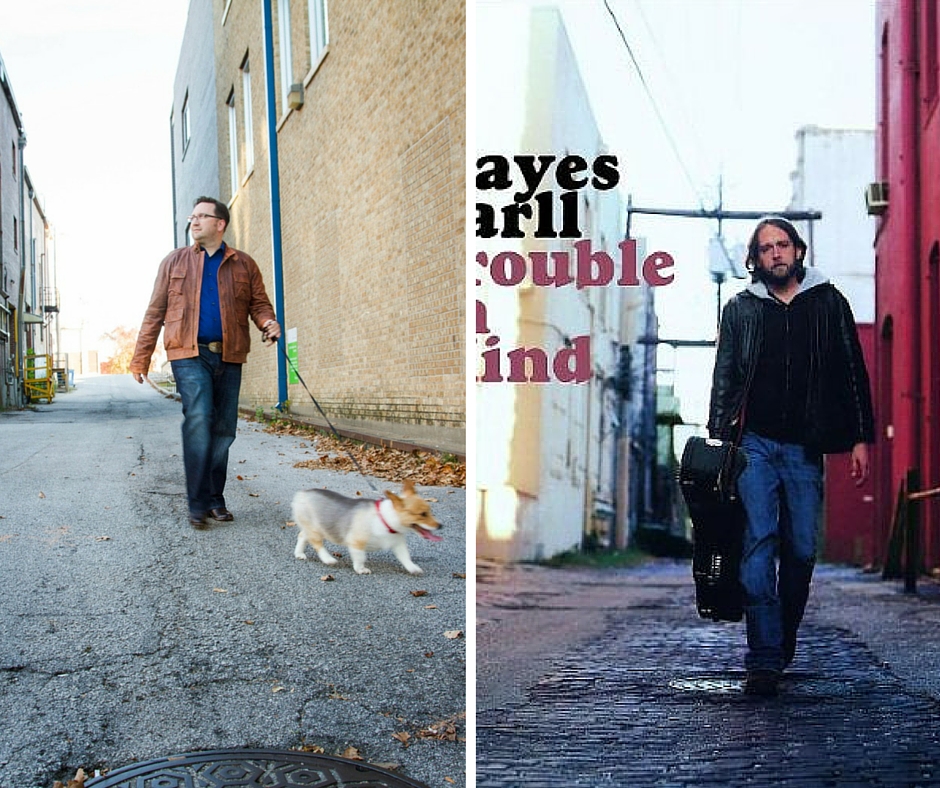
- Look to unusual sources like album covers: Just like all good marketers we have swipe files for graphic design, web design, content ideas, and even profile photos. Look to magazines, news images, and other sources to inspire you to create your perfect image. The profile image on my own personal Instagram and Facebook accounts was inspired by the Hayes Carll album cover to Trouble in Mind. I am fun like that sometimes.

A couple of other tips for your professional social media images
- No family photos. LinkedIn is not a place for your wedding photo.
- No pixelated images. Make sure your image is the proper size. Use
Canva if you need to make sure. - Smile if you can. If your business in serious stuff, a smile might not be appropriate. If you work for a clown college, then go for it.
- No crossed arms. You probably aren’t in the WWE and negative body language is a bad thing.
- Don’t change the photos every day. Or that frequently. Once or twice a year is good enough. Remember, we want consistency.
Your social media profile photo is one of the first impressions, and recurring brand points, of your professional image. Use it to your benefit. Or detriment.
The choice is yours.
Thanks for checking this post out. If you found it useful and still have questions, challenges, or obstacles to your social media or marketing success story you would like to discuss, feel free to reach out at any time!


